


I would try sandwiching the texture on overlay over the green, I really think it's missing something without the green mud smears on the stairs, though otherwise I like the parchment.


I would try sandwiching the texture on overlay over the green, I really think it's missing something without the green mud smears on the stairs, though otherwise I like the parchment.
Click my banner, behold my art! Fantasy maps for Dungeons and Dragons, RPGS, novels. No obligation, free quotes. I also make custom PC / NPC / monster tokens.
Contact me: calthyechild@gmail.com or _ti_ (Discord) to discuss a map!
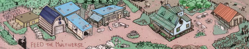
Thanks for the suggestionI'm not deleting any layers, so I can always try something new. I like the grass and mud as an idea, but I don't think they look great as I'm not good at colors or brushes yet. I'll see what I can do with an overlay of the parchment texture with the grass/mud and update the thread with a few new versions. I also finished the stone steps so those will be included with the new updates.
Thanks for the input and suggestions for the outside of the map. I made a few different versions now that I have the stone steps done so you can get a better idea of what I am intending the final version to look like.
As before, I don't really know what I like more on this so any comments or critiques are welcome
I don't know if I did the overlay correctly (I'm still neanderthaling my way around GIMP at this point), but the 3rd image has the parchment layer set to "overlay" on top of the "painted" grass and mud layer.Originally Posted by Tiana

Yeah, that's a good first way to start messing with texture overlaying. Although now that I see what you're going for with the steps the parchment alone might make it stand out better, I do like the layer overlay of the texture on the grass/mud. I fool around a lot with those layer blend modes and textures, that was a significant part in how I got started with digital art so I've always been fond of the result.
Click my banner, behold my art! Fantasy maps for Dungeons and Dragons, RPGS, novels. No obligation, free quotes. I also make custom PC / NPC / monster tokens.
Contact me: calthyechild@gmail.com or _ti_ (Discord) to discuss a map!
Alrighty, I have all of the steps more or less done. I may mess with the colors and brightness, but the shapes are done. With the steps done, I am leaning towards what Tiana suggested with the overlay of the parchment texture over the grass/mud layer. As I've stated before, I tend towards "dark and moody" or "dark and barely visible"so my personal choice would be the darker version of the outside with the overlay. I'm including 4 versions that I currently have, although any other suggestions or ideas are welcome for how to do the outside of the house.
Thanks for looking
The maps are looking good, I like the 4th yard the best.
My Battlemaps Gallery http://www.cartographersguild.com/al...p?albumid=3407
I like the fourth yard the best too. And you would not be alone with liking dark and moody best. Suggestion if you like the dark and moody. Copy everything merged at the end, and then, desaturate that and crank its contrast, and then set that on an overlay, or soft light. You could also delete the central part, feathering the edges out, so that you get this gloom outside and the brighter colors of the original assets inside.
Click my banner, behold my art! Fantasy maps for Dungeons and Dragons, RPGS, novels. No obligation, free quotes. I also make custom PC / NPC / monster tokens.
Contact me: calthyechild@gmail.com or _ti_ (Discord) to discuss a map!
Glad to know I'm not alone haha. I already took the parchment overlay and cranked down both the "lightness" and "saturation" to get the dark outside effect, but I hadn't thought about doing it with another full copy of the image. That should look really good, I'll test it out and post up the result.
I really appreciate the suggestions because I was looking to give the image a "gloomy" appearance but didn't really know how I was going to do it (originally I was just going to do a shadow layer over the outside because I finally figured out how to do that
For this purpose, dark and moody is definitely the way to go. If you were prepping materials for a Wodehousean romp, light and fluffy would be the way to go, but for Lovecraftian, totally dark and moody. It's "The Shadow Over Innsmouth" not "The Bright Sunny Skies Over Innsmouth".
I definitely agree. Although, I now want to see a chibi or pastel version of Innsmouth called "Bright and Sunny Innsmouth"
So I spent some time messing with various levels of darkness and shadow/gloom on the outside of the house. I took a copy of the outside of the image and did as you suggested, completely desaturating it and really ramping the contrast, then setting it on overlay (I messed with "soft light," but there didn't seem to be much of a difference). I really like the effect and ended up adding a smattering of darker areas and a darker, smudged border around the building itself.
While I enjoy how it looks, I did end up realizing that I need to redo the shadowing inside if I add this effect because the inside is now MUCH brighter than the outside
I know the decks and steps are still at full brightness. I'm intending to shadow them to match the outside with their own mask layer after I figure out how dark the actual outside will be.
Last edited by Hermit; 04-08-2020 at 01:10 PM.

 Reply With Quote


