Hi Kellri!
A warm welcome to the Guild!
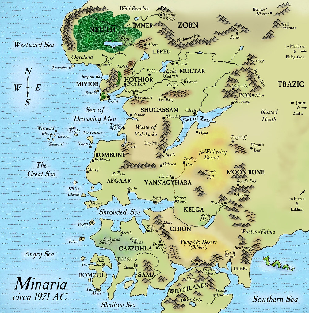
I've played Divine Right and always thought that their colour choices were a little too garish. Yours looks so much better. I can't think of any comments to make - it all hangs together really well for me. Perhaps the white outer glow on the text in the sea could be reduced a bit? I'm not mad keen on the repeated wave pattern either, it seems to be inconsistent to the style of the rest of the map. Perhaps use subtle changes in tone as you've done with the land?
All the best
Ravs


 Reply With Quote


